
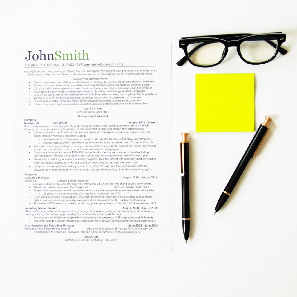
Believe it or not, font does matter. A lot. The font of a resume determines the aesthetic of the document, gives off the correct feel, and greatly determines how people view your document. Think of font like clothing. Even if you are showered and have your hair done, it’s your clothing that determines what you look like. You might have great information and formatting on your resume, but if you pick a font that’s hard to read, you’re not going to have a great document.
Decide if you want to go with a serif or sans serif font
What font should you use on your resume? When deciding, it’s important to decide between using a serif or sans serif font.
Serif fonts have small lines at the ends of characters, and are typically considered to be more ornate and traditional. Serif fonts are often used in print work because the serifs make the individual letters more distinctive and easier for our brains to recognize quickly.
Sans serif fonts (letters without the small lines at the ends) are considered to be more modern and minimalist. Still clean and easy to read, sans serif fonts are a good way to go if you’re looking for a clean and avant-garde resume.
A good rule of thumb is that if you’re applying for a job that’s considered to be more formal or traditional (i.e. financial, technical, administrative, legal, medical, etc.) use a serif font on your resume. If you’re applying for a more modern or nontraditional job (i.e. startups, tech industry, graphics, design, etc.) opt for a sans serif font.
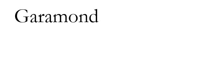
The best serif fonts for your resume
My go-to serif font is Garamond (usually size 11) but Garamond, Book Antiqua, and Georgia are generally my favorite serif fonts. Times New Roman is a standard font as well, but there has been controversy with Times New Roman in the past because it is often the default font in Microsoft Word. (Using the default font has even been likened to wearing sweatpants to an interview!)


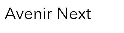
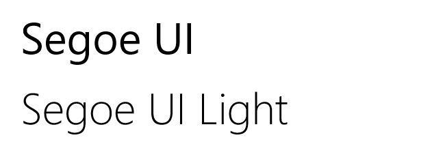
The best sans serif fonts for your resume
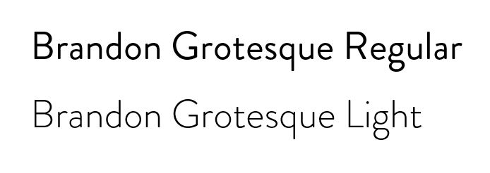
My favorite sans serif fonts are Avenir Next, Segoe UI, (both regular and light) Arial, (regular and narrow) and Brandon Grotesque (regular and light). These sans serif fonts offer minimalism, clarity, and clean lines throughout the document. Note that these fonts tend to be on the bigger side, so you may have to size down to 10.5 or even 10 in some cases to make things proportional.

______________
What font should you use on your resume? Make the decision based on the job you’re interested in applying to. The font will determine the vibe of your document, so it’s extremely important that the connotation of the font correlates with that of the job. More traditional positions are best suited to use serif fonts such as Garamond, Book Antiqua, and Georgia, while jobs in technology or startups will often be better suited to use sans serif fonts such as Avenir Next, Segoe UI, Arial, and Brandon Grotesque. Ultimately you want to use a font that is clear, easy to read, and the correct size. Unless using a large font, (Avenir Next, Segoe UI, and Arial can all be used in size 10) do not go smaller in font size than 11, and no bigger than 12.
I use Gill Sans as my body & job title font. I’ve found that it offers a great balance between an avant garde and a traditional look. It is the standard font used in the UK (think London Underground signs), so it looks fresh to US eyes while still satisfying the ‘traditional’ bug.
I use the Gotthard font for larger items, such as my name & section titles. Because it is wider than it is tall, it gives the impression of forward movement.
Great tips Paul! Thanks for sharing! Will look into Gill Sans and Gotthard.
Regarding: “Still clean and easy to read, sans serif fonts are a good way to go if you’re looking for a clean and Avant guard resume.”
It is not “Avant guard”
It is “avant-garde”
Or even “avant-guard”
But the former is generally better.
https://www.merriam-webster.com/dictionary/avant-garde
Thanks for pointing this out!